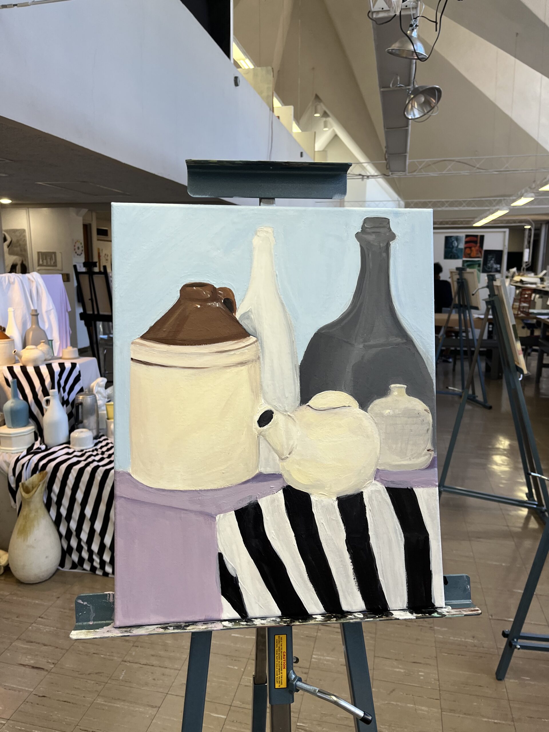
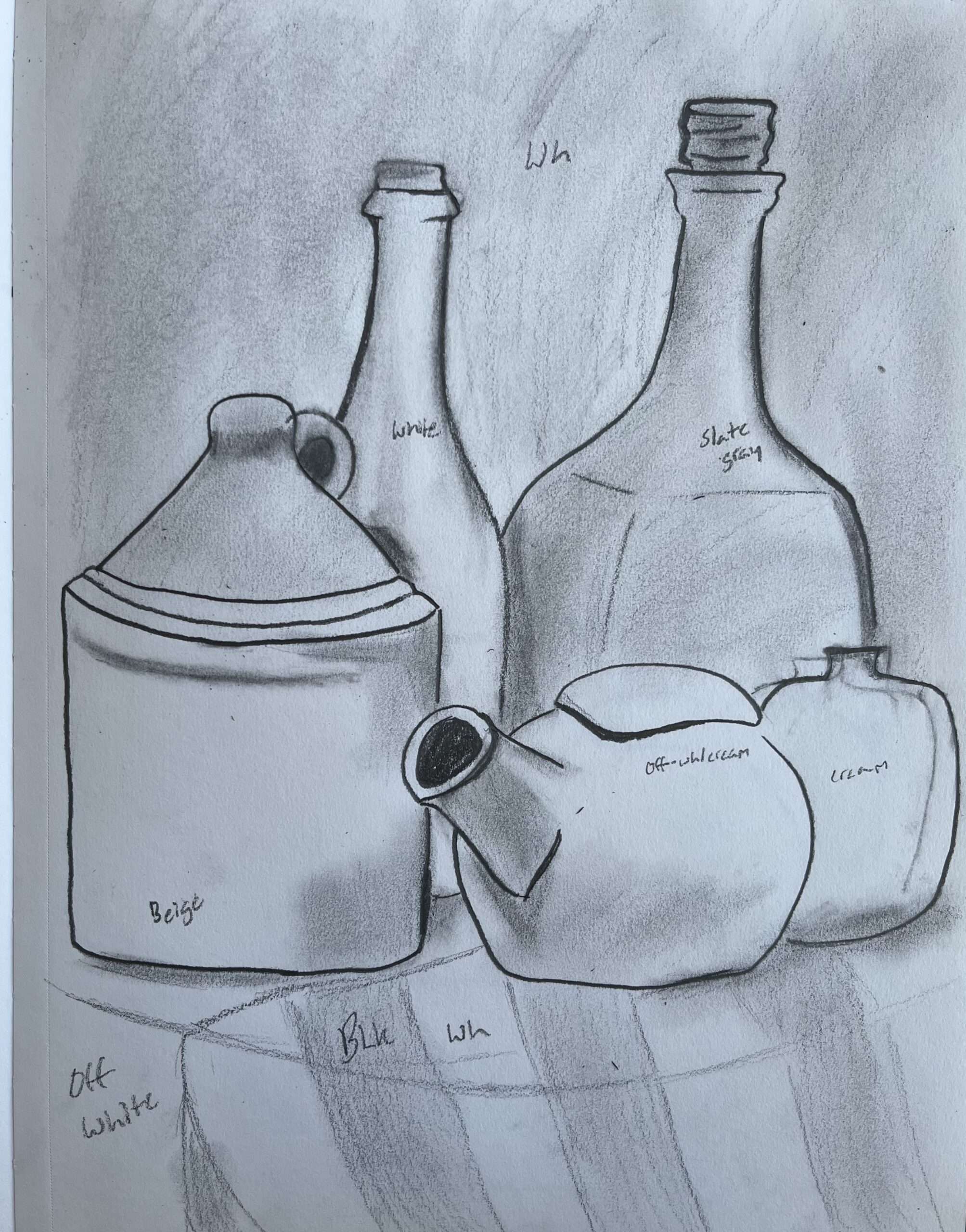
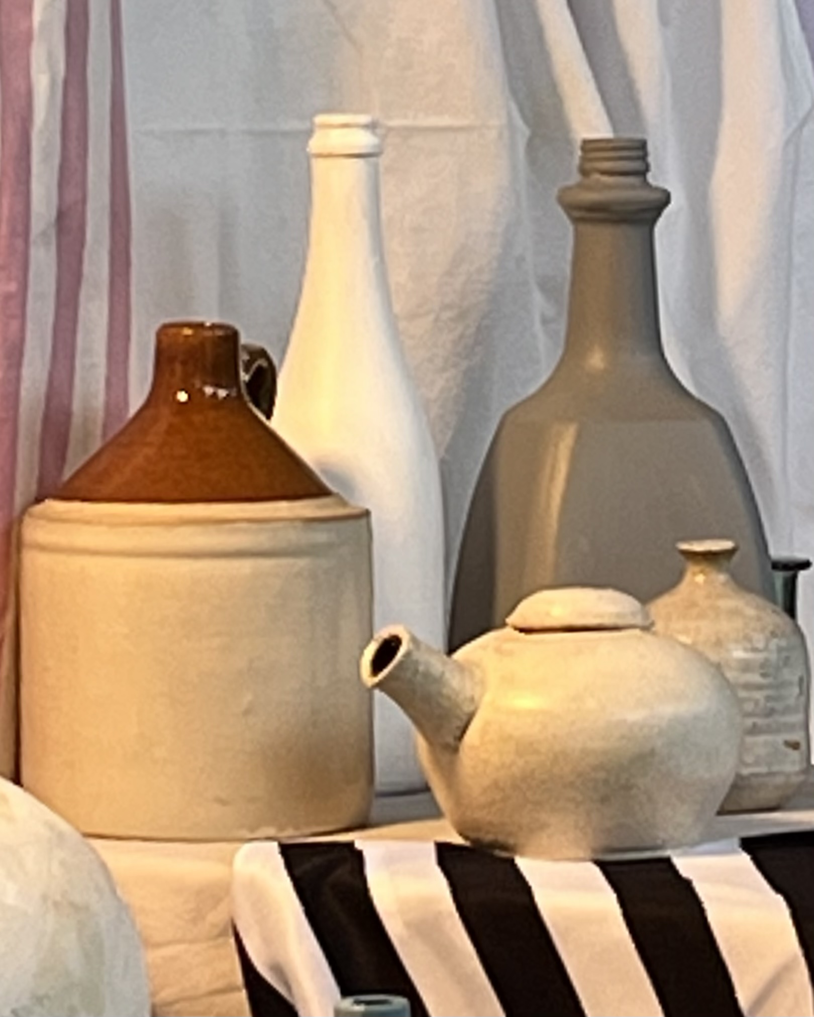
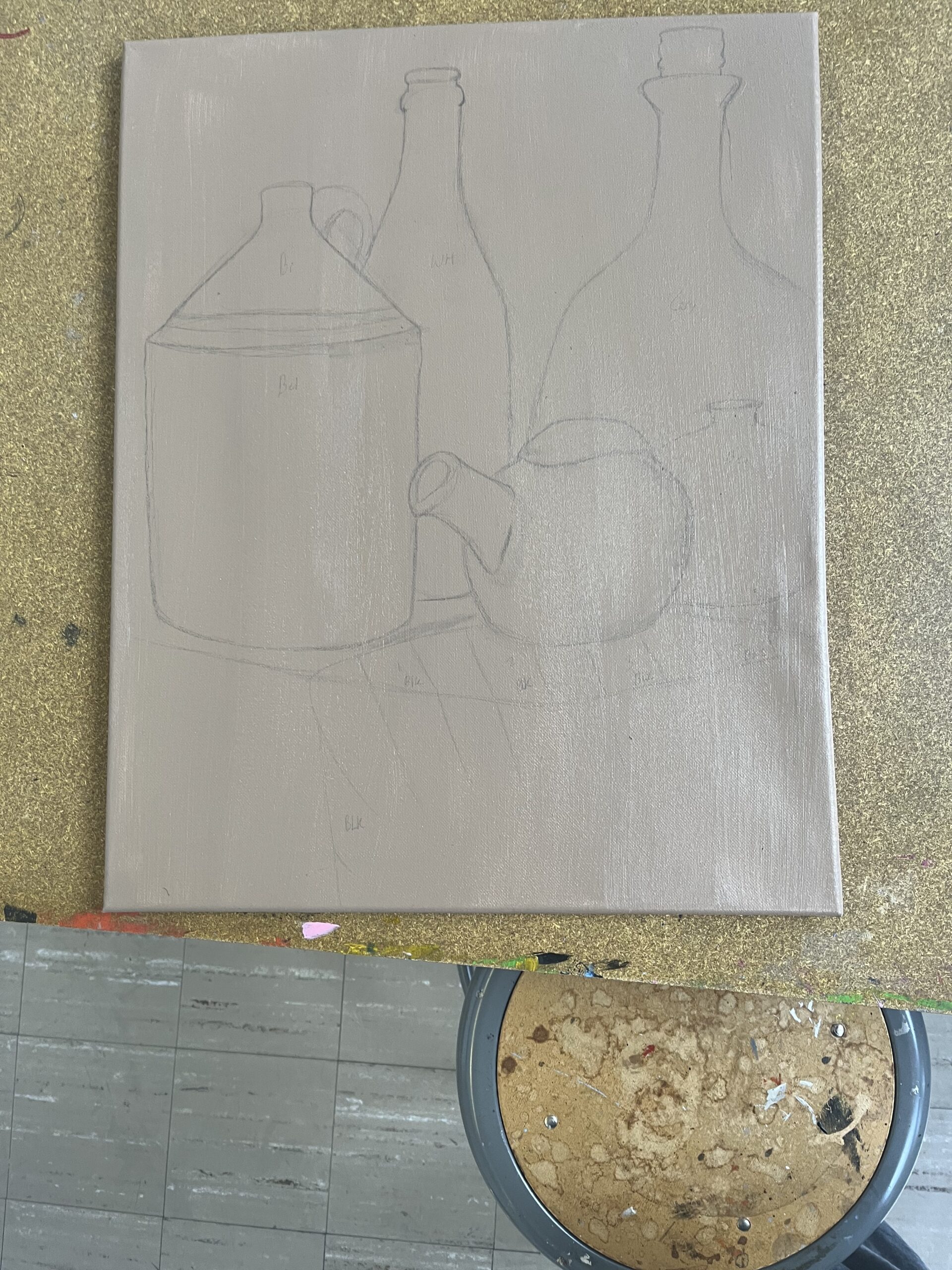
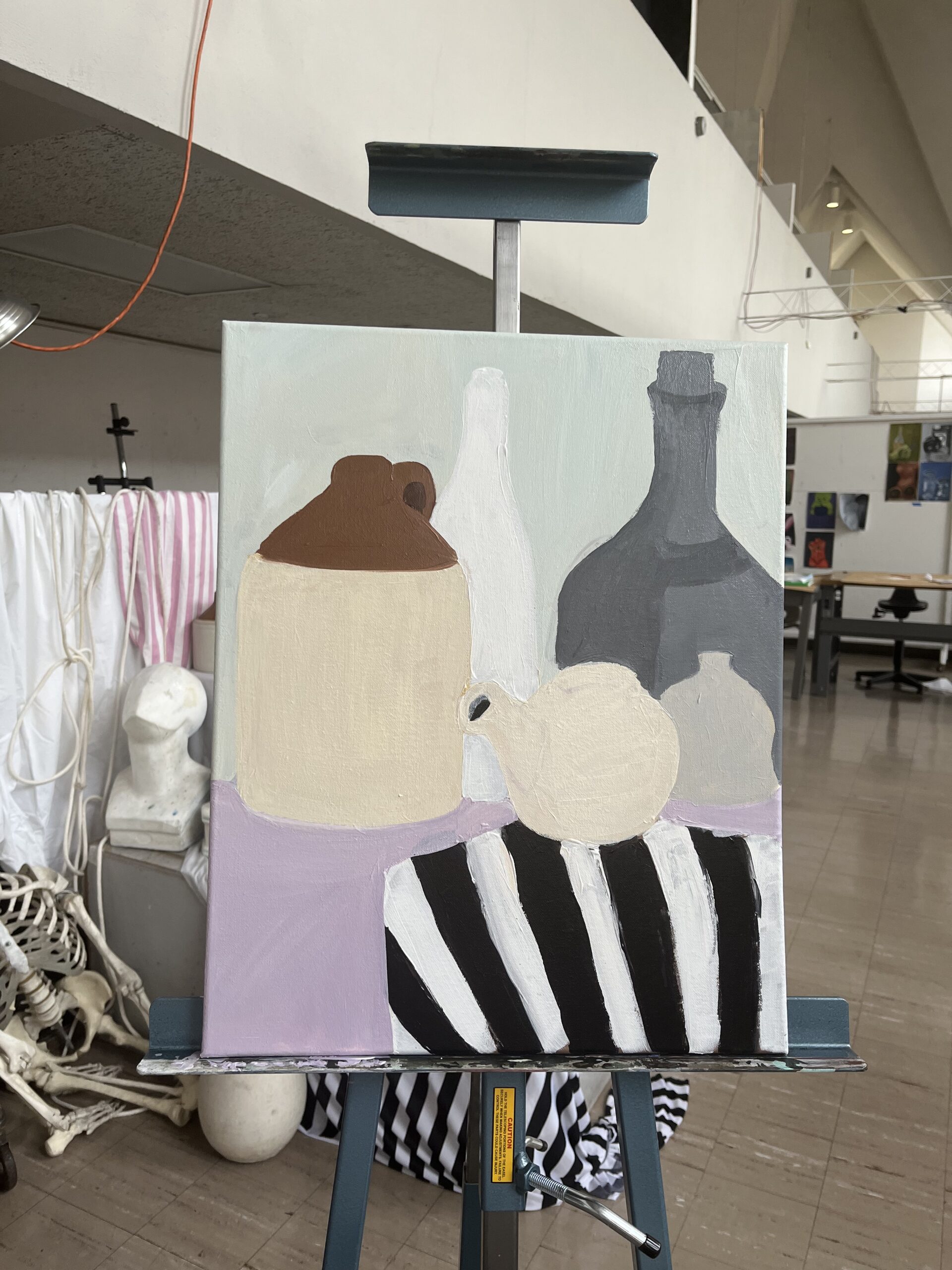
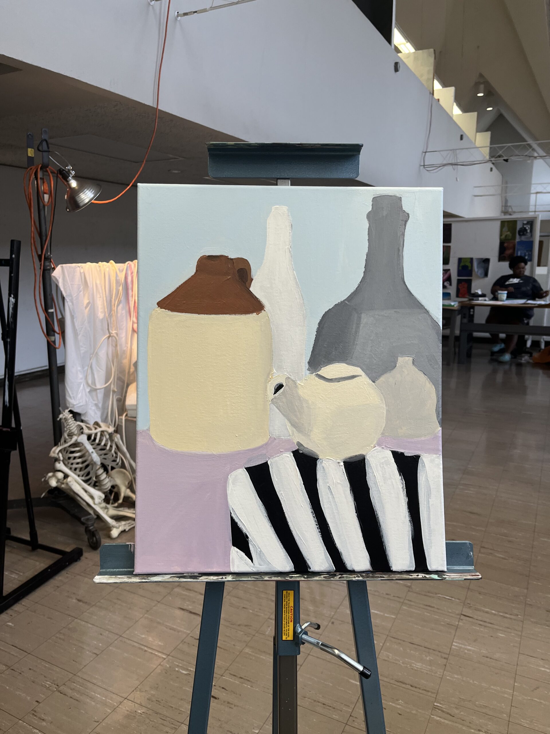
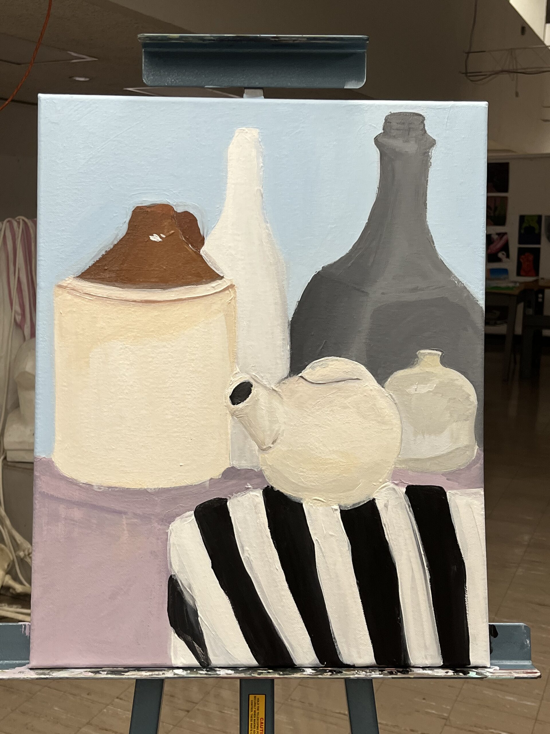
The “still life” challenge, my ability to use a limited number of color and present the accuracy of my subject. I first started off with a pencil drawing of the subject to get an idea of what shapes I needed to focus on, and the distance between each object. I also used my sketch as a guide, to determine what and where colors would be placed on the canvas.
On the canvas, I start out with a light brown base (using umber, white, and burnt sienna) to give my palette a strong foundation for the lighter colors to stand out on. I started to experiment by mixing different colors together: black, burnt sienna, umber, yellow, and white— these remained my main go to colors for the still life.
I believe the most challenging process was making sure that the jug, tea, pot, and vase did not have the exact same color. Though very similar, each had a different tone. The jug was a bit more warm, the tea, pot, neutral, and the vase cool. Another challenge was getting the accurate shape and shading for each object. The gray bottle was extremely difficult to shape properly. Shadows were a bit difficult, because for the most part, they were pretty minuscule, however, the shadow from an object forming on another, was challenging. For the jug and white bottle, I had to determine what color the shadow was, and how to blend it without it being too obvious.
Another challenge was the stripes within the image, but I believe if I was able to shade and highlight each one well enough to illuminate the corner of the base the items sat on.
If there were any thing I would want to change in particular, it would be the background. I wanted the items to stand out on their own, but I do see potential for playing around with texture from the still life in the background. Overall, I believe that this is accurate to the photo used for inspiration.
